

Case Study: Luzerno Padel Resort
Case Study: Luzerno Padel Resort
Role: Brand Identity Designer & Visual Strategist
Role: Brand Identity Designer & Visual Strategist
Role: Brand Identity Designer & Visual Strategist


Context
Padel is growing fast, but branding in the space is lagging behind. Most clubs still look like short-term sports projects, loud, trend-driven, and visually interchangeable. That approach might win attention early, but it doesn’t hold up once the brand moves into physical space and long-term operation.
Luzerno was never meant to be just another padel club. The ambition was to build a destination, something that feels considered, intentional, and relevant years down the line. My role was to define that direction and translate it into a brand system that could actually support it.
The Problem
The real problem wasn’t aesthetics. It was positioning.
How do you speak to serious padel players without alienating lifestyle-focused guests? How do you communicate luxury without becoming distant or overly polished? And how do you avoid blending into a category that already looks repetitive?
Strategic Direction
The key strategic decision was to compete on experience rather than intensity. Instead of framing padel as something aggressive or hype-driven, Luzerno was positioned around immersion, where performance and hospitality carry equal weight.
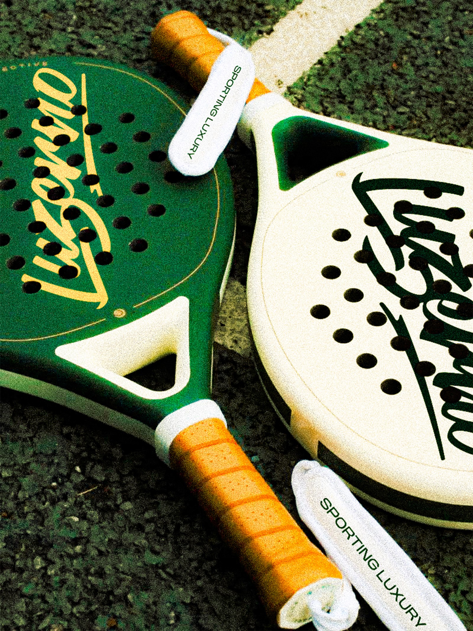
Visual Approach
The visual identity was built with restraint by design. Simple structure, clear spacing, and warm tones keep the brand balanced instead of attention-seeking. Every element has a purpose, nothing is there just to fill space.
This makes the identity easy to apply across courts, architecture, signage, apparel, and digital. In real, physical spaces, a brand works best when it’s clear and simple, not overly decorative.
Strategic Direction
The key strategic decision was to compete on experience rather than intensity. Instead of framing padel as something aggressive or hype-driven, Luzerno was positioned around immersion, where performance and hospitality carry equal weight.
Visual Approach
The visual identity was built with restraint by design. Simple structure, clear spacing, and warm tones keep the brand balanced instead of attention-seeking. Every element has a purpose, nothing is there just to fill space.
This makes the identity easy to apply across courts, architecture, signage, apparel, and digital. In real, physical spaces, a brand works best when it’s clear and simple, not overly decorative.
Color & Atmosphere
Color was treated as an environmental decision, not a branding trick. Muted, natural tones work better in sunlit and architectural settings and reduce visual fatigue over time. Instead of trying to stand out in isolation, the palette supports how the space feels when you’re actually there.
Typography & Structure
Typography does a lot of the heavy lifting. Clear hierarchy, and precise spacing ensure the brand communicates well. Rather than using type to express personality, it’s used to reinforce confidence and structure. A quiet decisions, done properly.
Tone of Voice
The verbal identity follows the same logic as the visuals. Luzerno doesn’t overexplain itself and doesn’t try to convince its members. It speaks directly. Confidence here comes from knowing who the brand is, not from trying to impress.

Strategic Direction
The key strategic decision was to compete on experience rather than intensity. Instead of framing padel as something aggressive or hype-driven, Luzerno was positioned around immersion, where performance and hospitality carry equal weight.
Color & Atmosphere
Color was treated as an environmental decision, not a branding trick. Muted, natural tones work better in sunlit and architectural settings and reduce visual fatigue over time. Instead of trying to stand out in isolation, the palette supports how the space feels when you’re actually there.
Typography & Structure
Typography does a lot of the heavy lifting. Clear hierarchy, and precise spacing ensure the brand communicates well. Rather than using type to express personality, it’s used to reinforce confidence and structure. A quiet decisions, done properly.
Tone of Voice
The verbal identity follows the same logic as the visuals. Luzerno doesn’t overexplain itself and doesn’t try to convince its members. It speaks directly. Confidence here comes from knowing who the brand is, not from trying to impress.
Visual Approach
The visual identity was built with restraint by design. Simple structure, clear spacing, and warm tones keep the brand balanced instead of attention-seeking. Every element has a purpose, nothing is there just to fill space.
This makes the identity easy to apply across courts, architecture, signage, apparel, and digital. In real, physical spaces, a brand works best when it’s clear and simple, not overly decorative.
Color & Atmosphere
Color was treated as an environmental decision, not a branding trick. Muted, natural tones work better in sunlit and architectural settings and reduce visual fatigue over time. Instead of trying to stand out in isolation, the palette supports how the space feels when you’re actually there.
Typography & Structure
Typography does a lot of the heavy lifting. Clear hierarchy, and precise spacing ensure the brand communicates well. Rather than using type to express personality, it’s used to reinforce confidence and structure. A quiet decisions, done properly.
Tone of Voice
The verbal identity follows the same logic as the visuals. Luzerno doesn’t overexplain itself and doesn’t try to convince its members. It speaks directly. Confidence here comes from knowing who the brand is, not from trying to impress.
Outcome
Luzerno feels distinct in the padel space without relying on trends. It works across sport and lifestyle contexts and is ready to scale without losing identity.
Most importantly, the brand supports the experience instead of competing with it.
Outcome
Luzerno feels distinct in the padel space without relying on trends. It works across sport and lifestyle contexts and is ready to scale without losing identity.
Most importantly, the brand supports the experience instead of competing with it.
Outcome
Luzerno feels distinct in the padel space without relying on trends. It works across sport and lifestyle contexts and is ready to scale without losing identity.
Most importantly, the brand supports the experience instead of competing with it.